When the Watermouth baseboards were rebuilt to try and standardise the sizes, we were able to add about 14" to the terminus beyond the bufferstops, this opened up the possibility of creating a bit of streetscape to put the station into some sort of context. There was also a large empty space behind the station building which Pat English clearly intended for something but left no indication of what. The logical answer would be a hotel, owned or at least leased, by the GWR. A search revealed several possible candidates but many were too ‘grand’ or just too big. Fortunately a very old photograph of the original Railway Hotel at Exeter came to light which seemed to have just the right amount of self importance but still remaining within the scope of a relatively modest country town.

Later pictures showed the Hotel to have been greatly extended and the original classical proportions lost. By making some educated guesses I was able to scale off the few images I could find to get a reasonable likeness of the original façade including the very attractive (and challenging!) curved front corner.

The elevations were set out on good quality stiff white card approximately 0.5mm thick which had a slight texture similar to watercolour paper. Once the windows, doors and other features had been drawn up, the card received a coat of shellac to both sides to stabilise it. This is an ages-old method that goes back to the days of Edward Beale and John Ahern. Thin card well shellacked creates a tough waterproof sheet that cuts very cleanly and takes paint well. Much of the rolling stock on Rev. Peter Denny’s Buckingham was built with this stuff. Artist’s shellac is getting difficult to find these days, but a good substitute is knotting sold in any good hardware shop.

Once the shellac had dried for 24 hours, the windows and doors were cut out with a new blade and the outer facades sprayed with Halford’s white primer. I used this because it gave a nice flat finish with a slight texture, and also it is slightly ‘off-white’ so good for representing whitewash.

Windows were always going to be the big feature of this building and there are a lot of them! Club colleague Stephen Grant drew up the artwork to my measurements and had them beautifully etched. They are in three parts; the outer frame and two casements. The favoured colour scheme was to be black and white which always seems to suit these late Georgian, early Victorian buildings. The outer frames were batch sprayed with rattlecan matt black and the sashes matt white primer. The earliest photograph shows the building to have had dark painted windows which was common in Victorian times, but by the 1920’s white paint was becoming increasingly widespread. The parts were assembled with cyno-gel which allowed for a bit of time to adjust, glazing was the plastic covers from Wills plate girder bridge kits of which we have quite a few!

The windows were fixed with Evo-stik which I know to be pretty permanent. The curved windows presented a challenge, but in fact were quite straightforward; I decided to try curving the entire assembly, glazing and all, rather than individual components and ending up with a mis-match. The technique was just the same as for forming locomotive parts; the piece was placed on a pad of resilient foam rubber and rolled with a length of brass bar. Amazingly nothing came adrift and after a few trials, the window frame matched the curve of the wall.

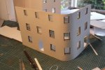
The main facades were backed by a thick card carcass to give strength and this had the window apertures cut over-size to accommodate the outer frames. Not wishing to tempt fate, I decided not to make a backing for the curved section, reasoning that it should be strong enough with the three window frames glued in.

Thats the hard bit done!

It don’t look so pretty from the rear! (but then, do any of us?) A box-work of painted card strips was built up around each window to create the reveal to the inner wall. Many modellers don’t bother to do this, but it is worth the effort because when glimpsed through the window it adds realistic depth to the building.
Doors and frames were cut from thin card and sprayed matt black, but this looked a bit ‘dead’ so I added a coat of satin varnish to give a bit of relief. The inner lobby was fabricated from thin card painted suitably dull colours and given a quarry tile floor. The glazed inner doors have etched glass panels (pencil behind tracing paper) featuring a classical urn with foliage, thankfully not too visible once the rooms are closed in!


The building to the far left in the original photograph I took to be stables, fortunately it has its back to the viewer! So only the ends and rear wall were modelled. It was connected to the main hotel by a curious little single storey building which appeared to have some sort of decorative pediment. The detail in the photograph is not clear so I concocted a bit of neo-classical architecture to give it some interest. It appears to be a secondary entrance to the main building so I gave it a shallow pitched roof and a long skylight suggesting a glazed passage leading to a separate guest entrance.

Adding curtains, floors and internal walls next!


")